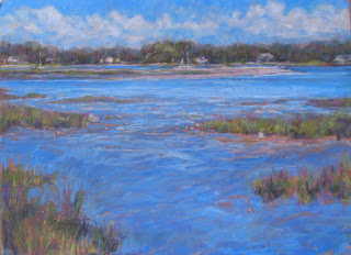
I'm not sure whether this painting is a lost cause. I muted the distant shore and cooled down the colors to show distance/atmosphere, but I don't like it as much as I did before. I added a foreground, and am still playing with the shapes of the grasses that I added, but I still like it better without. I'm confused about what my focal point is --if it is the distant shore in the background, does that mean that the higher contrast and stronger colors from yesterday work better? At this point, the values and colors in all the areas are all too much the same, and I'm not sure where to go with this. I don't have any reference to use for the foreground, so I'm just winging it, without much success. I'll put it away for now, and when I have more time will try to resolve it.
Thursday, June 12, 2008
Subscribe to:
Post Comments (Atom)


1 comment:
Personally, I don't think the darkest dark and the lightest light don't have to be a part of the center of interest, as long as that combination is a device that leads your eye to the right place.
My eye is clearly lead to the distant shore, and I think the sky and water work well together. I don't know what it looked like before, but I think this is a winner as is.
Post a Comment